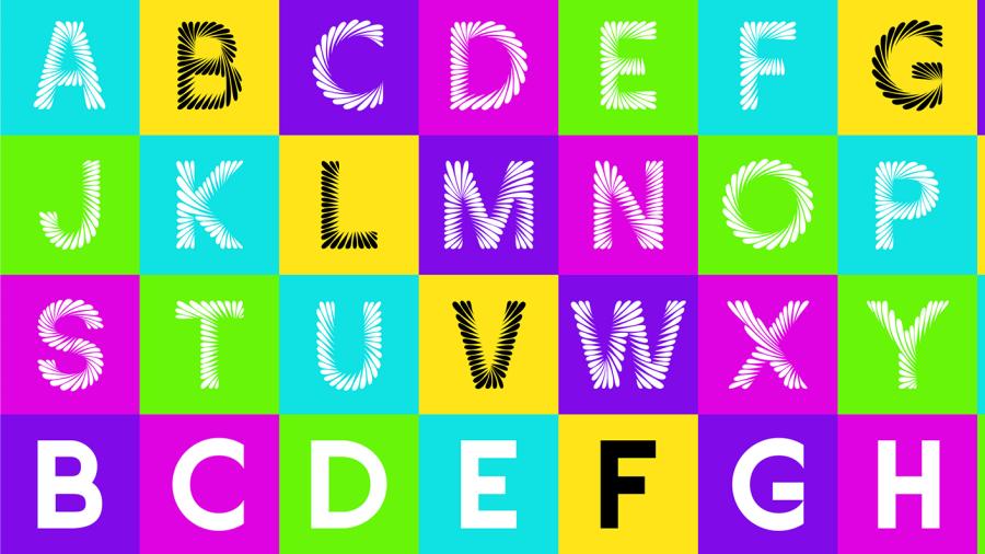
Amanda Piotrowski hoped to make a splash when she created her “uniquely expressive, situationally very trippy and overall exciting and energizing” typeface called Vertigo.
The alphabet of swirling, colorful capital letters by the UW-Stout senior, who is majoring in graphic design and interactive media, did just that.
Piotrowski, from Pittsville in central Wisconsin, created a bigger splash than she expected, however. Her website was accepted recently by three national online galleries, CSSReel, CSSLight and CSSNectar and also was featured on all three sites as a Site of the Day. It also will be featured on One Page Love, which posts single-page sites to provide inspiration, templates and resources.

“Vertigo represents the culmination of my education and experiences in graphic design and my passion for typography,” Piotrowski said.
Professors Robert Fraher and Alex DeArmond taught the courses last spring in which Piotrowski created the typeface and the website.
“The publication of the site in the online galleries can be understood as a stamp of approval of it being professional-level design,” Fraher said. “The fact that the site also received an award from one of these galleries further evidences it being something special.”

With Vertigo, named after a health condition that causes dizziness, she aimed to represent visually how a person’s eyes travel through typeface forms. On the website, the letters that spell Vertigo are animated. “It’s an exciting opportunity for an engaging, interactive experience of typography,” she said.
Piotrowski blended skills she learned in several classes. In Typographic Design, taught by DeArmond, students were assigned to create a display typeface, which “are expressive and used for large-scale elements like titles, headings and pull quotes,” Piotrowski said.
Using a mechanical pencil and a blank sheet of paper, she sketched some ideas. Then, she re-created the 26 letters using special software called Glyphs. Each letter has two dozen or more swirls of varying shapes and sizes.
“I recognized the potential in Vertigo's forms and envisioned an interactive web design experience for my type specimen. I also knew that I wanted to include the skills that I had learned in my Motion Graphics course taught by Professor Augustus Hinton to compellingly animate the letters to add more visual interest,” she said.
She received support from Fraher, who was teaching Advanced Interactive Design. He was impressed with Vertigo and saw the potential of it being published. As a result, Piotrowski used another assignment in Fraher’s class to create the website, which features her typeface in motion as she explains her creative process.
DeArmond called Piotrowski’s website a “type specimen” that introduces the font to users. “Amanda was able to communicate all the energy and movement inherent to her typeface design via the website she developed. She did exactly what we would hope our design students do, which is to find connections between their various studio classes to create work that goes further than just the project outline,” he said.
She worked an estimated 210 hours on the project, including research, wireframing, visual design and website development. “It was a lengthy process, for sure, but definitely a labor of love,” she said.
The project taught her the value of committing fully to a project and tapping her creative and technical skills. She also created Vertigo Sans — the letters without the swirls.
“I think it’s hard for students to really believe that we are capable of industry-quality work. It would have been easy for me to disregard advice suggesting further development for Vertigo, citing time constraints as an excuse. However, the invaluable guidance and support I received from both Bert and Alex during the development process played a crucial role in pushing Vertigo to its fullest potential.
“Truly the faculty in the GDIM program at UW-Stout are excellent educators who care deeply and passionately about the success of their students; their dedication is a marvel and a true asset to the UW-Stout community, and I would not be where I am today without them,” she said.
Another design honor
Simultaneous to creating Vertigo, Piotrowski created a website in Fraher’s course called Designing and Color Blindness. She pursued the issue after it arose in a fall class, User Experience Design.
“I aim to educate designers on how to consider color blind users, why it’s important to do so and to provide resources,” Piotrowski said.
Her project also was accepted by CSSReel, CSSLight and CSSNectar and featured on two of them.
Piotrowski, who graduates in December, would like to continue on the path of web and interactive design as she begins her career. “Additionally, I have a strong interest in typography and aspire to explore opportunities related to the design of typographic forms.”
Fraher expects her to do well. “I believe Amanda has a very bright professional future,” he said.
Because she sees potential for the Vertigo typeface commercially, she plans to create a set of lowercase letters, punctuation and symbols. “It possesses qualities that make it suitable for headlines and other prominent typographic applications,” Piotrowski said.
UW-Stout’s School of Art and Design, with six Bachelor of Fine Arts and two Bachelor of Science programs, is the largest in the Upper Midwest with more than 1,200 students.
Like Piotrowski, another UW-Stout graphic design student in 2018 had his work featured on the One Page Love site.
###


